Responsive design
Interface designed mobile-first, tested from 320 px wide up to large screens, in light and dark themes when needed.


Services
Markish Tech designs and builds custom websites —company sites, landing pages, product and event sites— with Astro or Next.js. Every site ships with responsive design, technical SEO, structured data and WCAG 2.2 AA accessibility, and is measured with Lighthouse before it goes live. We also redesign existing sites without losing the rankings they have earned.
Interface designed mobile-first, tested from 320 px wide up to large screens, in light and dark themes when needed.
Custom components in Astro or Next.js with TypeScript, no visual builders or heavy templates.
Unique titles and descriptions, clean URLs, canonical tags, sitemap, robots.txt, hreflang for multilingual sites and JSON-LD structured data.
AVIF/WebP images with responsive sizes, optimized fonts and minimal JavaScript. Measured with Lighthouse on mobile and desktop.
Semantic HTML, sufficient contrast, visible focus, keyboard navigation and forms with announced errors.
Forms validated on client and server, direct WhatsApp and email links and a privacy notice.
We define goals, audience, required pages and how the site's success will be measured.
We map the site and structure each page around what people actually search for.
Wireframes and visual design aligned with the brand, validated before coding.
We build the site and run automated checks for links, metadata, accessibility and performance.
Deployment on Vercel, sitemap submitted to Search Console and a documented final measurement.
Events · Functional fitness
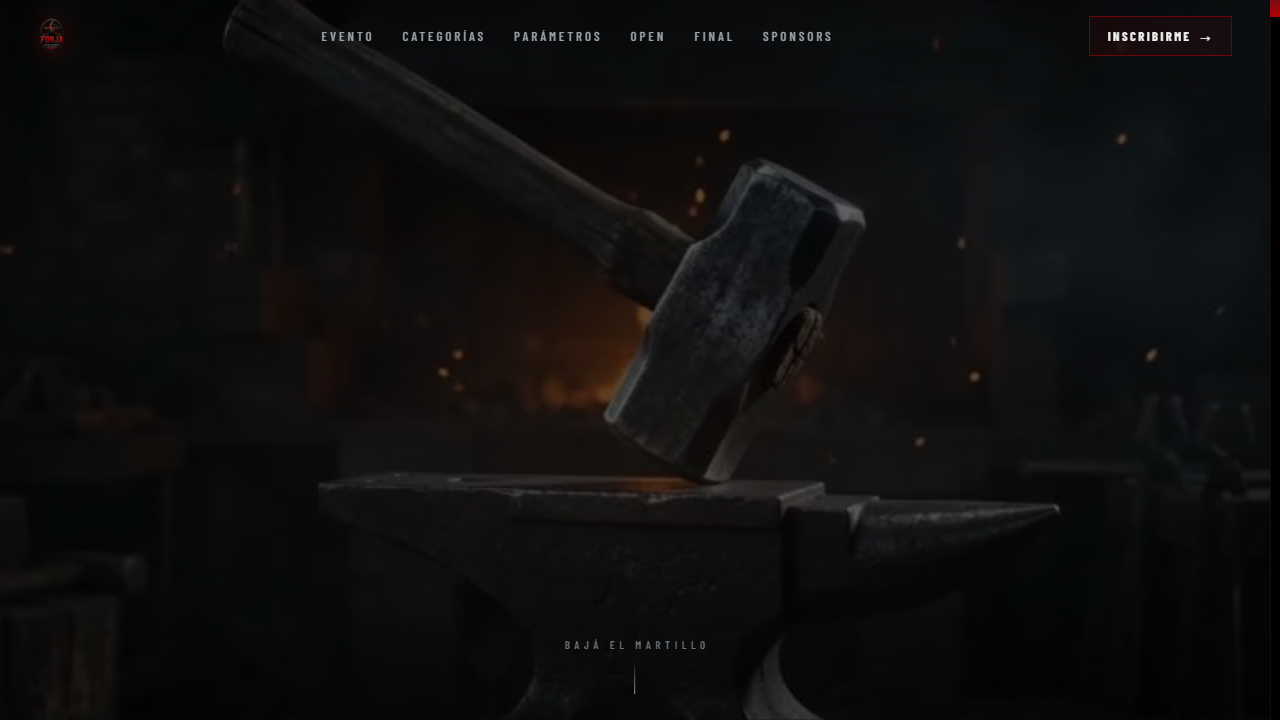
Client project
Case study of the official FORJA Challenge 2027 website, a functional fitness competition. A narrative landing page built with Next.js and scroll-driven animation.
A template ships generic design and code meant for many cases, so it usually loads more than needed and is hard to adapt. A custom site is built for your pages and content: it loads only what it uses, respects your brand and can be extended without fighting someone else's code.
It depends on the project. For mostly content sites (company sites, landing pages, event sites) Astro delivers static HTML with very little JavaScript, which helps speed and SEO. When the site needs heavy interaction, user sessions or server logic, Next.js is usually the better choice. This site is built with Astro and FORJA Challenge with Next.js.
Yes. Before changing anything we list the URLs that receive traffic, keep each one or redirect it with a 301, preserve titles and content that work, and verify in Search Console after launch.
Yes. We design mobile-first and automatically test that there is no horizontal overflow at 320, 768 and 1280 px widths.
Tell us what you need and we'll reply with an initial proposal and next steps.
Pick the channel that suits you best. We reply within 1 business day.
WhatsApp+54 9 11 5164 9895 (opens in a new tab)Emailmarkishtech@gmail.comContact formTell us about your project